As we all know, academic research in humanities involves many areas, like languages, anthropology, literature, area studies, history, philosophy, culture, law, religion, arts, linguistics and so on, which indicates that a large number of data need to be collected and dealt with in the process. So the importance of how to deal with and present these data in a more effective way has caught more and more attention. As one of these aspects, I will focus on data visualization. Data visualization is the study of the visual representation of data, meaning “information that has been abstracted in some schematic form, including attributes or variables for the units of information” (the link http://en.wikipedia.org/wiki/Data_visualization gives a brief introduction about data visualization). With the development of technology, the ways of data visualization have been turning diverse, with a trend that the revolution of data visualization in humanities will never stop, developing to multi-dimensional.
VSim: A new interface for integrating real-time exploration of three-dimensional content into humanities research and pedagogy
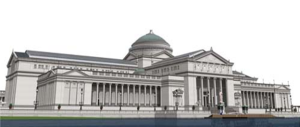
As one of the central studies in humanities, the study of the built environment has been talked about in this paper. It presents VSim, a new software interface for integrating real-time exploration of 3D content in humanities and pedagogy. Two examples in Fig.1 and Fig. 2 respectively show a screenshot of the Fine Arts building, now the Museum of Science and Industry, and the Street in Cairo, from the Urban Simulation Team’s reconstruction of Chicago’s World’s Columbian Exposition of 1893.
Fig.1
Fig.2
These two leave us a general impression on the 3D content function of this new software interface. It could not only provide users with three modes of navigation, including a mechanism for creating linear narratives through the virtual world that can be augmented by texts and images, but provide a way for content creators to link to primary and secondary resources within the modeled environment. By using VSim, the data have been transferred into 3D content, which gives us such a real-time environment and much more sensory perception. This interface and 3D content make it easier to present the real environment and relative background information, which not only encourages the users to adopt this way to do the research and pedagogy in humanities, but encourages the readers to follow this way. This paper shows us that the revolution of data visualization will think more about the sensory perception and easy interface.
Visualizing Centuries: Data Visualization and the Comédie-Française Registers Project
From 1680 to the present day, the Comédie-Française (CF), France’s national theater troupe, has kept daily records of its repertory, box office receipts, and expenses, as well as additional information. In this paper, the Comédie-Française Registers Project (CFRP) is mentioned, which seeks to provide access and new ways to analyze the data above, from creating database, applying the parameters, filtering data and receiving results. It demonstrates the relationship between original sources, tool creation and new research questions from visualization. From the implementation of CFRP, it is clearly that one of the most important parts during the research process is data visualization. As for the database, visualization tools should be used, and as for the search tools, they should be directly integrated with the visualization tools. These visualizations encompass layered histograms, heat maps, parallel axis graphs, and flexibly scaled timelines. This paper emphasizes the process of discovery in research, which tells that never just use the visualization to demonstrate pre-existing conclusions, but allow the new questions and new patterns so that to create new visualization tools. That means new visualization tools should be constantly added to the research, which contributes to the revolution of data visualization ways.
Visualizing Uncertainty: How to Use the Fuzzy Data of 550 Medieval Texts?
This paper shows us a project, using the web-based tool GeoTemCo (Jänicke, 2012) to visualize thousands of place names against a focusable timeline.
Fig.3
This in Fig.3 is the current GeoTemCo user interface, showing 636 data points from the Franco-Italian dataset and a timeline represented as a stacked graph with multiple aggregated uncertain temporal values (increased saturation designates increased certainty in lineage value). The time line below does not represent the real temporal data of this project. This project combines space with time, using a more effective way to present the historical literature. By proposing a way of dealing with temporal uncertainty, it demonstrates the strategies for simultaneous visualization of various aspects of data, which indicates that data visualization needs to be multi-dimensional and including various aspects of information.
Though all of these three papers are about data visualization, they have different emphasis. The first one is focused on 3D content, which is aimed to provide easier interface and much more sensory perception. It shows us the multi-dimensional trend in humanities from the aspect of people’s perception, like 3D environment, images and so on. The second one pays much more attention on the data analysis process. That means it presents the multi-dimensional trend in a transverse aspect, through data analysis to create new data, so as to create new visualization tools. The third one combines space with time to demonstrate the historical literature, which transfers various aspects of data into one map of places and time. It shows us the multi-dimensional trend from the aspect of how to combine various aspects of data as a whole unit.
In summary, there will be more and more data visualization tools and data visualization ways. The researchers in humanities tend to use more effective ways to collect, deal with and present data, and meantime the readers would like to see easier and more intuitional ways to understand their data. This contributes to the visualization developing to multi-dimensional, like considering the aspects of the planar, the three-dimensional, time, perception and so on. With the persistent revolution of data visualization, it will turn more and more multi-dimensional.
http://dh2013.unl.edu/abstracts/workshops-004.html


